Chart Tooltip
Simple steps to create new Dashboard
Fast Track ⏱️
Understand creating dashboard in 5 minutes by playing!
tip
Only users with Dashboard privilege have access to this sectionr!
Read 5 minutes tutorial here.
Chart widget will enable users to create customized charts using their own data to depict the data in different visualization.
Follow the steps to create Column chart:
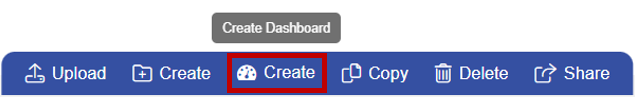
Go To Visualization Section From Top-Left Hamburger Menu.
Find Horizontal Menu at the bottom of the Grid, Click on Create Icon.
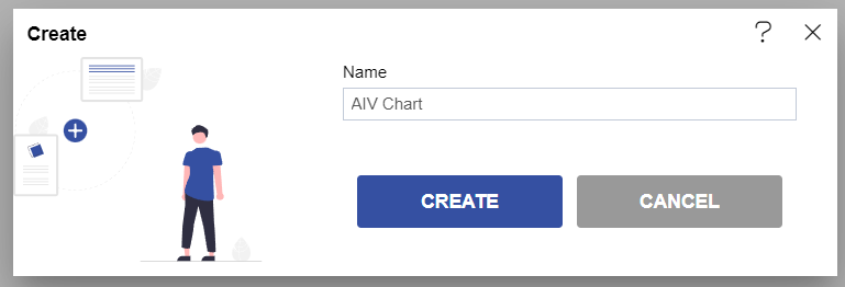
- The Create Dashboard Dialog box will Pop on the screen like:
6-306b9f4c2717979d30e66e931cd71e14.png)
- Enter Name and Click on Create Button.
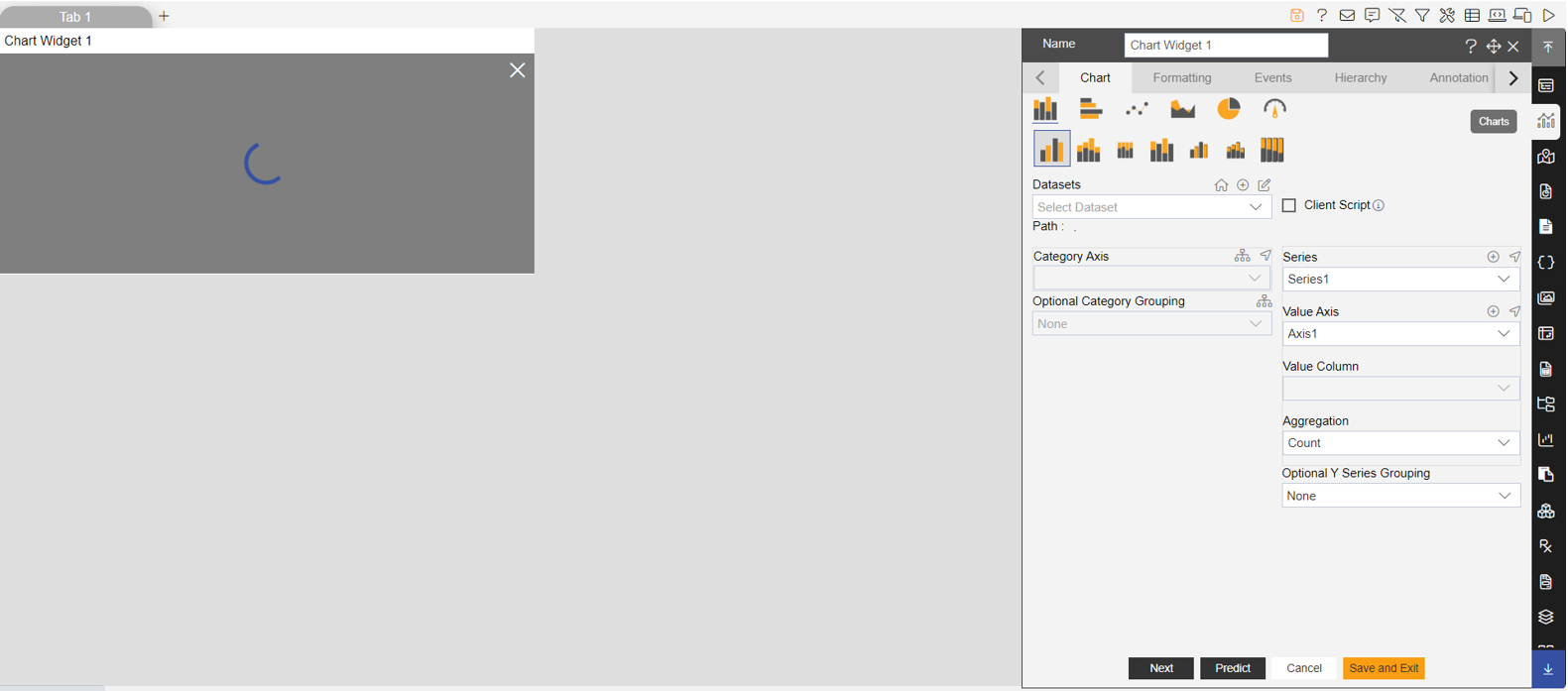
- Click on the Edit Dashboard icon from the top right corner menu, a list of the available component will open up as follows:

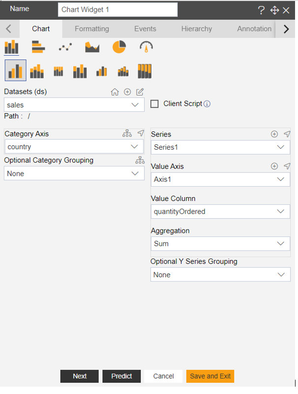
- Click on Chart Component from the list of component into the dashboard, a configuration box would open as follows:
- As seen in the above figure, the OPNBI application enables the user to create a variety of charts such as column, bar, area, line, pie as well as advanced charts such as funnel, pyramid, radar, candlestick, OHLC, variable radar and all charts with scroll.
- Select the type of chart you want to use and select datasets from the drop-down menu.
- For our example we will be working with Pie Chart and will use Sales.cds database.
- From available Data Columns select the required column from the dropdown in the Category (X).
- In Value column select the required column from the dropdown.
- Select appropriate Aggregation in the Aggregation option.
- Click on preview.